Sam's Typography/ Graphic Design Blog
Monday, August 27, 2012
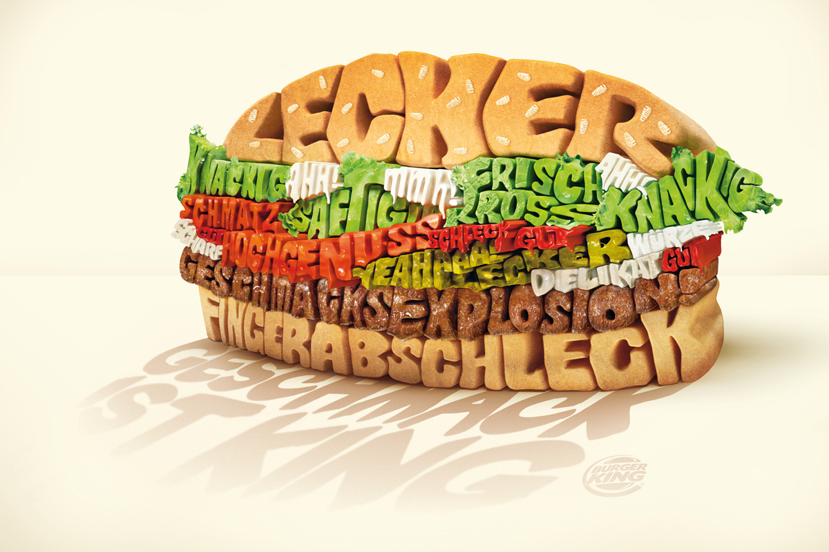
Not so good
To me this is not a good example of image and text going well together. I feel like all the colors make it hard on the eye and all the text being smashed together makes it very hard to read.
No comments:
Post a Comment
Newer Post
Older Post
Home
Subscribe to:
Post Comments (Atom)
No comments:
Post a Comment